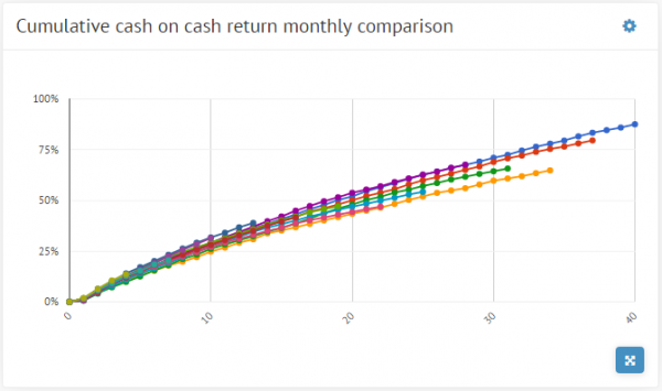
Do you ever ask yourself, “How long will it take for my investment to generate a return?” The cumulative cash on cash return monthly comparison chart can give you some insight. This data is another new addition to our revised public statistics page.

Simply put, the chart summarizes the progress that the investments from specific vintage are making towards the goal of repayment and, eventually, earning a return. The data on the horizontal x-axis shows the number of months that have passed since the investment was made. As the duration grows, the line slopes upwards as the cumulative amount repaid (seen on the y-axis) increases. Each curved line represents another year by default.
The line extends above the 100% mark as investments surpass the original principal. Crossing that milestone means investments are starting to earn a return on top of the initial investment amount. The further back you look in years, the longer the line will be because the investments have had more time to mature.
Users can only view one loan duration (or vintage) group at a time (i.e. 12, 24, 36, 48 or 60 month). The reason: combining different vintages within the same chart leads to incomparable data. However, you can choose to isolate the data to a specified period of time. Simultaneously, you can view the data by monthly, quarterly or yearly vintages depending on how granular you want to get.
Finally, given that smaller portfolios experience greater volatility, the chart only reflects data from periods where a minimum of 200 loans were issued. For this reason you may need to extend the increment of periods (e.g. quarterly or yearly rather than monthly.)


