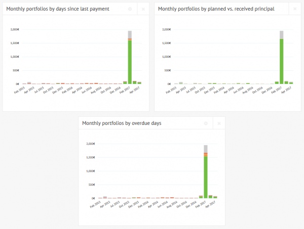
Three new charts on the General and Personal Statistics Page offer up to date performance data for investors. This information is part of our ongoing effort to create transparency. Each of the following charts are built from an intuitive design which looks at the performance of the portfolios ordered by monthly period cohorts. Each chart shows the data by different criteria.

Monthly portfolios by planned vs. received principal
Use this chart to see the current, overdue, and repaid principal for each monthly vintage. On the General Statistics Page you’ll notice that the relationship between the current balance and the repaid balance changes as you move to the present. The portion of the total which is repaid decreases because more of the loans are new. In previous years the repaid balance is a greater portion because the loans in that group have matured. Investors will also want to pay attention to the trending overdue amounts. Again, this portion drops as you move towards recent months because issuances are newer.
Monthly portfolios by days since last payment
The information in this chart provides an overview of the timeliness of payments made. Each line is segmented to show the portion of payments that are current, repaid, or have seen the following days pass since the last payment: 1-7, 8-15, 16-30, 31-60, 61-90, 91-120, 121-150, 151-180, and 180+. Like the previous chart discussed, as you approach recent months a larger portion of the payments are current because loans have not aged as much.
Monthly portfolios by overdue days
This chart is similar to the above where investments are divided into cohorts of overdue duration. This information offers the best data for risk management because the proportions each loan status category is visualized and easy to understand. When investing in marketplace loans investors cannot come face-to-face with the borrowers. Therefore investors must rely on analytics to gauge risk, this chart accomplishes that goal. This chart has another commonality with the the first two: A rising trend of total payments. As we’ve grown our investors have grown with us. As you look across the timeline you can see loan totals increase.


