With our next release, we are excited to introduce you our brand-new Expert Center and advanced Statistics page. Regarding statistics and reporting in general, this is our biggest feature release so far. During 2015 we gathered feedback from our investors about what their wish list would look like concerning data. Our engineering team tried to grant most of the wishes and we hope that you like the result. Now, we’ll invite you to our little data tour!
STATISTICS PAGE
Our upgraded Statistics page features all the most valuable charts and reports that help you keep track of your Bondora portfolio. All the necessary information about your account, returns, processing of overdue loans etc. are now easily accessible on one page without you having to look around for information across multiple pages.
- 1. INVESTMENT
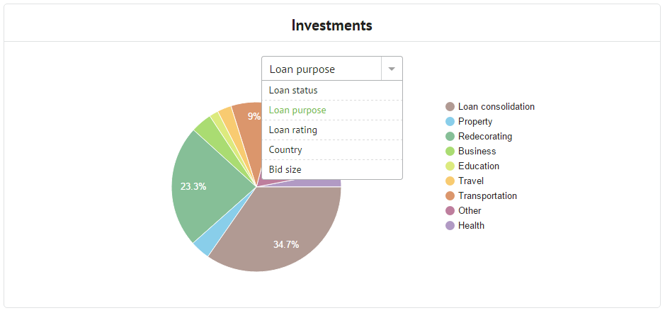
We added a drop down menu where you can now find loan charts by 5 different criteria:
1. Loan status – shows investments principal amount proportions according to repayment schedule.
2. Loan purpose – shows investments principal amount proportions by loan purpose.
3. Loan rating – shows investments principal amount proportions by Bondora Rating.
4. Country – shows investments principal amount proportions according to country.
5. Bid size – shows investments principal amount proportions according to balance of the bid.
- 2. COMPARISON OF NET RETURNS OF DIFFERENT INVESTORS
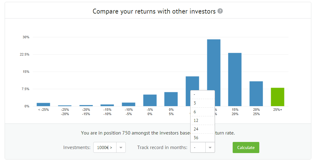
This chart compares the performance of different investors across the entire portfolio. You can see how many investors fall within a certain range of returns and the data can be further filtered by the size of investors’ portfolios as well as the length of their track record. The chart also shows your position in this comparison.
- 3. ANNUALIZED NET RETURN ON INVESTMENT
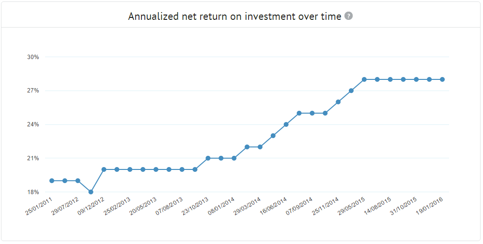
This chart demonstrates the annualized net return of the portfolio at a certain given time. Only payments made and scheduled until that date are considered in this calculation.
- 4. INVESTMENT QUALITY PER MONTH
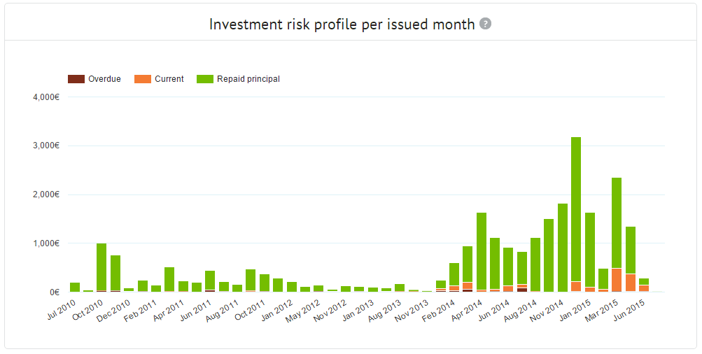
This graph shows your loan status in historical view. Investment quality is highlighted by the proportion of overdue loans.
- 5. ACTUAL RECOVERY RATE COMPARISON
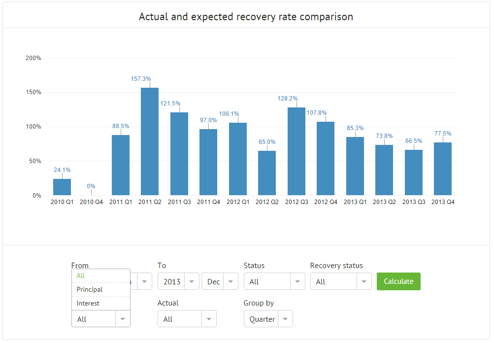
This chart shows recovery information about investor’s current portfolio including all loans which have defaulted at least once. Percentage is calculated by dividing actual repayments since the loan first defaulted by scheduled payments until today. You can filter the period, the current status of the loan, its recovery status (in collection or recovery) and group the results by month, quarter and year. Recovery Status filter allows you to look at the results segmented by the way how the specific non-performing loans are being currently handled. Cases that are being pursued through legal recovery are found under Recovery and cases that are being processed by Bondora or debt collection agencies are found under Collection. This easier classification replaces the previous stages report. You can also choose which repayments (either all, principal or interest) you are comparing to which part of the schedule. This report allows you to establish discount probability factors for the future planned cash flow report we are introducing below.
EXPERT CENTER PAGE
Our brand-new Expert Center features more complex and specific charts that cater the more advanced investor. It combines Data Export, Cash Flow, Account Statement and Authorized Apps into one page. We are releasing Expert Center as a Beta version – your feedback is most welcome to us so we can improve the functionality even more.
- 1. HISTORICAL CASH FLOW
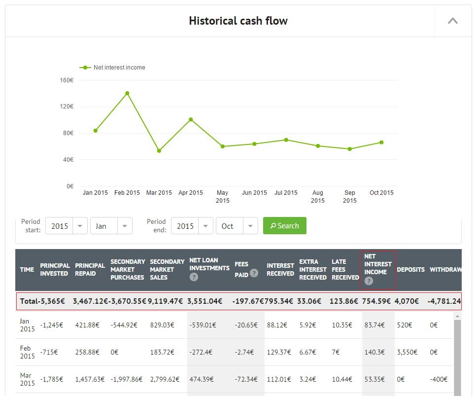
This chart shows your monthly cash flow based on actual transfers. We are loving the convenience of the row TOTAL that sums up the period you have searched for. Also, a column that comes in handy is NET INTEREST INCOME that shows your cash flow and how much you have earned.
- 2. FUTURE PLANNED CASH FLOW
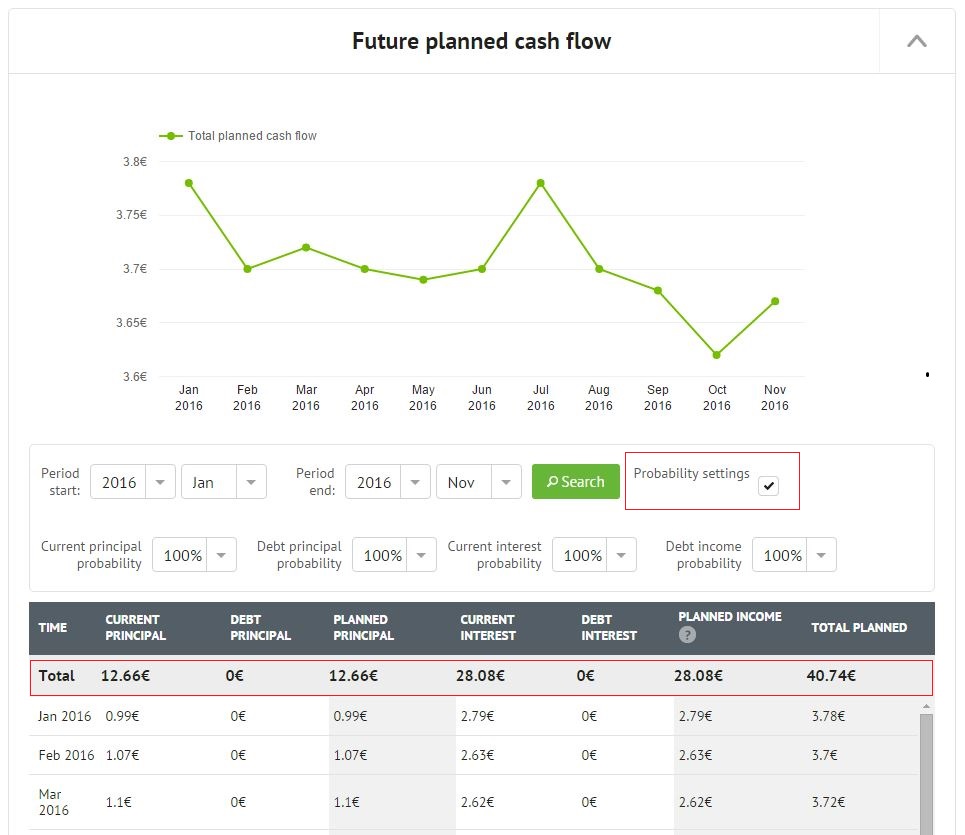
This chart shows monthly future cash flow based on scheduled payments. An important snippet on this forecasting chart is – Probability settings – where you can set the probability on your planned cash flow. For example, if you set the debt probability to 50% then it will show 50% of the amounts under the according columns. You can also save the settings you have once chosen and they will be available the next time you log in. The row TOTAL sums up the period you have searched for.
- 3. ACCOUNT STATEMENT

This chart shows the transactions for the last 24 hours.
- 4. DATA EXPORT
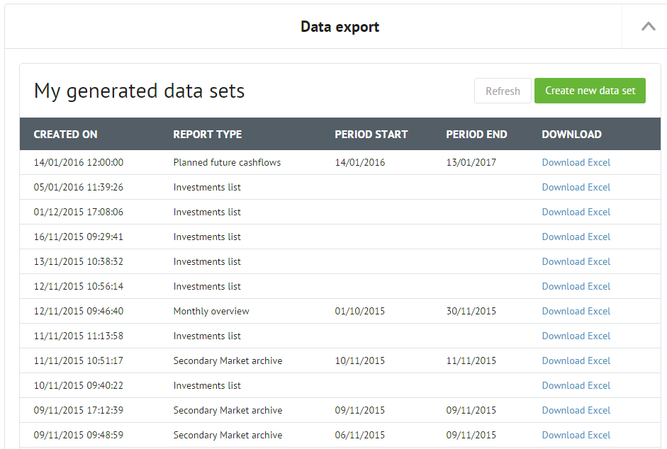
If you need more data about your account statement then you can use this data export functionality. It gives you a specific and detailed view for a longer period.
- 5. AUTHORIZED APPS
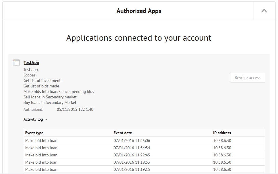
This table shows all the API tokens registered to user and the activity log.
Please note that the data on the charts is illustrative and is not based on actual data.
