Last week we introduced recovery statistics for investor’s personal portfolio and we are continuing in similar lines for the entire platform portfolio.
Introducing the recovery rate graph for Bondora
We are currently working to bring you a graph that highlights the progress of the recovery on our platform level compared to expected recovery.
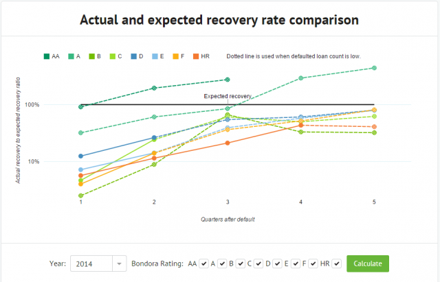
The graph will select all the loans that defaulted within the selected year and calculates their weighted expected recovery based on the expected recovery used in Bondora Rating. This will enable us to highlight the actual recovery to expected recovery ratio for each quarter after the loan defaulted.
In other words, the graph shows you how well the loans in each of the Ratings are recovering at certain points in time compared to what was expected in their Bondora Rating calculations.
Example:
If the weighted average expected recovery for a group of loans within a Bondora Rating is 30% and actual recovery after 6 quarters is 45%, then the graph will show this as 150% out of expected recovery has been reached for that Rating.
For data points where the count of defaulted loans is relatively low, we have used a dotted line to highlight that the results could be based on only a few loans and it can be subject to significant shifts when recovery statistics for additional loans will come in.
We hope that this graph will give you a quick way to see how the actual recovery progress is going and has been going throughout the time on our platform.